Role
Senior Product Designer
Range
Web app functionality, Onboarding, Design System, Mobile app functionality
Market
Customer Success B2B
The problem
Main challenges
50k+ DAU. This is the core, the most used view in the app. The main challenge was to retain beloved easy of use.
5+ years of development by multiple product teams before redesign. The entire redesign was spearheaded by three teams: Communicator, Ticketing, and Integrations, and me as an only designer.
Tech debt. Navigating known and unknown technical debt while addressing the redesign iteratively proved challenging due to various constraints.
Extensive user testing. Conducted by myself, PMs, and the entire UX Research department, employing both qualitative and quantitative methods via usertesting.com and additional tools.
Our customer success team as early adopters. Believing that if the redesign resonates with them, it will serve as a solid foundation for the rest of our users.
No in-app contextual onboarding back then. While adding tooltips may seem straightforward, integrating them with the existing dependency system, and running A/B tests posed significant challenges.
Functionality for the users we'd like to acquire. Balancing new features for potential customers with preserving the experience of existing micro businesses.
Iterative release strategy. Defining an MVP, selecting target cohorts, and managing the migration process.
Solutions
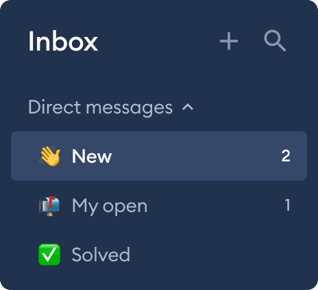
Revamped main menu with a split-column layout
Differentiate between live chat, ticketing, social media, and reviews by providing context-specific submenus. All of them are collapsable, so user can only focus on what matters to him.
Refreshed live chat
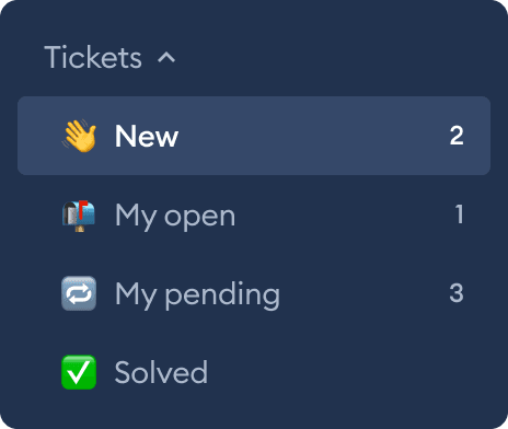
To grow with users from a one-man army to different departments handling different types of messages, my task was to unify Live Chat and Ticketing as much as possible from the UX perspective, so that it would be a natural evolvement for everyone.

Introduction of ticketing
Initially, we tested ticketing as a separate module. However, we found that many users were confused by having to switch between views and manage multiple notifications. To improve the user experience, we officially integrated ticketing into One Inbox.

Social media integration ready
To create a system that can accommodate any new integration, I developed components in the design system that are modular, flexible and adaptable. Each integration can have its own tab in One Inbox, and the view can be customized to meet the specific needs of the integration. This allows agents to respond quickly and efficiently, or to have a chatbot do it for them. Also it provides an ability for different teams work on different integrations in the same time.
Onboarding
In a world where value is delivered iteratively, there is always a lack of time for flourishes or details that are of little significance, but have a positive impact on the user experience, especially in startups. In our case, we knew that a poor onboarding experience could lead to a significant drop in MRR. To address this, I partnered with another team to create contextual tooltips and a comprehensive onboarding strategy for the release.
Impact in numbers
daily active users
months of work
user tests
teams involved
screens designed
components created
Current state
As for 2024, 2 years since my departure from Tidio, and the One Inbox design I created remains largely unchanged. This testament to its enduring quality.
Thanks to Tidio team, I've learnt a lot about the cooperation between different teams, and departments operating with C-suite to the people who fight on the front edge of the battle area called development. I still love these people and meet them frequently.


